
Clean data is the best weapon against the monkey insurrection
Updated: I added the link to the rough cheat sheet of handy and common Refine tasks at http://bit.ly/ire12refinecheats. Send me your favorite tricks to add to the list!
This is a rough walkthrough of the class I’m teaching at the 2012 IRE conference in Boston on how to use Google Refine to clean data. If you’d like to see them, these are the slides from the session, http://bit.ly/ire12refineslides. Please forgive the weird line returns of WordPress. If you hit any hiccups or have suggestions for improvement, please leave a comment or mention me on Twitter @ultracasual.
You’re faced with a dilemma that’s fairly common in many newsrooms.
Say, for example, a series of accidents kills a number of children crossing busy streets near you. Now, you want to know the deadliest roads or intersections in your area (this is not the dilemma, just wait for it).

We always say in the news business to check it out, and we shouldn’t trust anecdote and the frailty of human memory. So where do you go?
Does this guy, right, look like he has an encyclopedic knowledge of every fatal accident in your five-county coverage area?
File a public records request and get the data. It should have the answer you need, right? You pick up your CD with the data, or if you’re really lucky, the state police will have a file you can download from their website. You expect to get a tidy Excel spreadsheet with very orderly numbers on it. Everything will be geocoded, and you’ll just need to do one quick pivot table or one quick group-by query and drop it into Fusion Tables and BAM! you’re done with your story. It writes itself, right?

You laugh, but this is what I spent years believing, and every time I was–and continue to be–flabbergasted by the sloppiness of the public data I get my hands on.
When I worked on the dangerous intersections story, I got something that looked like this:
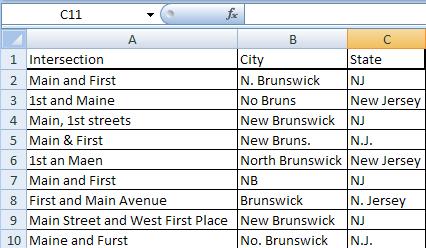
(This is a dramatization)
As David Donald said in his CAR panel yesterday, cleaning is the longest and hardest part of the data process. Assume any data you get is dirty and full of holes.
Government data is hardly unique in this respect, but it is our bread and butter, and frankly we should expect better from the government, so I’ll pick on it today.
Why is so much public data such a mess?
-
Much like journalists, government agencies are not nearly as good with numbers as they ought to be.
-
When databases exist, they are often built on things never intended to be turned into relational data, like hand-written accident reports.
-
Many agencies seem to subscribe to the infinite monkey theorem.

For anyone unfamiliar with it, the infinite monkey theorem more or less says that given an infinite amount of time and an infinite number of monkeys with typewriters, eventually the monkeys will write the complete works of Shakespeare or “A Tale of Two Cities.”
When you work with a lot of public data, this is what feels like. Occasionally there’s something correct, but before you find it, you have to wade through what seems like a near-infinite number of errors. I’m not suggesting that government employees are primates, but I am pretty certain that they’re outsourcing their data entry to monkeys… and it gets worse.
Because these monkeys are not geniuses.

They are enemies of good data.
These monkeys are mean, and they hate puppies and clean data (and water). To be fair, in my completely unscientific survey, the data has gotten better in the past decade, but it’s not where it should be.
Every data entry mistake possible will be made. Often you fill find new mistakes that you never, ever would have considered or imagined in your wildest dreams.
These clerical errors will make your life miserable. You can either welcome our new monkey overlords or you can arm yourself.
The old tools
-
Excel: filters, pivot tables, string functions
-
Access: Group by queries
-
Notepad++: Regular expressions
-
Scripting language for automated, repetitive cleaning
With these, the cleaning of the database could take days or weeks or longer.
Now you can do it with Google Refine in a few hours or less.
![]()
It can take that crap and turn it into a diamond.
What is Refine good at?
-
Transforming data, either on individual cells or whole columns at a time
-
Clustering data to find similar values that repeat for exploration and cleaning
-
And many, many other tasks.
Refine does a lot of really amazing things, and this class will give you just a tiny taste. It can help high-level programmers with repetitive tasks, and it has its own expression language for accessing and scrubbing data. But it is also a great tool for the less technical set. If you’re comfortable with Microsoft Excel, you should be right at home with Refine. You don’t have to be a comp sci PhD to love it.
The two big areas we’re going to concentrate on today are clustering data and transforming it
So let’s get started. Here are instructions to install Refine on your computer.
We’ll start with a dataset of lottery winners from New Jersey. Say you want to know what areas spend the most on lottery tickets but win the least.
Download the lottery dataset here.
Refine runs through your web browser, but don’t worry, it works offline as well.
You can import a table file in many formats, either from your computer, from Google Docs or from a URL for a file on the web. Once you have Refine running, click “Create Project.”
You’ll see a preview of what the data looks like. When you pull in the CSV of lottery data, make sure to uncheck the “Parse cell data…” option.
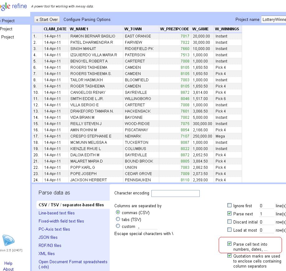
New Jersey zip codes start with zero. If Refine guesses that column is a number, it will drop the leading zero, so unchecking the option will preserve the zips as text.
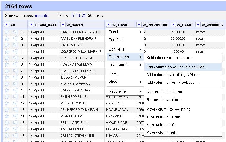
With this data, we’re going to use Refine to clean up the W_TOWN column to standardize the names of municipalities. But we never want to work with the raw data, so let’s copy the column that we’ll actually transform into something usable. So click on the arrow at the top of the W_TOWN column and choose the Edit Column>Add column based on this column option.
Enter a name for the new column. We’ll use “TOWN.” Original, I know.
Now, initially Refine will only display 10 rows, but there are 3,100 in this dataset, so let’s look at a for more. Click the number 50 next to “Show as” to see more.
In Excel, one of the first things you’d do with a dataset is sort it. So click on the arrow at the top of the TOWN column and choose “Sort” from the options. Now, you can filter out just a few records. Click on the arrow and choose “Text Filter” from the options. You’ll see a box pop up in the left column. Type in Atlantic and see how it plucks out only the towns with “Atlantic” in the name: Atlantic City, Atlantic Highlands, Atlantic High and West Atlantic City. As you might guess, not all of these are real towns.
Let’s lose the filter. Click on the X in the upper left corner of the filter box. Now, we’re going to add a Facet> Text facet. Dan Nguyen at ProPublica calls Refine’s faceting “the better way to filter.” He’s totally right.
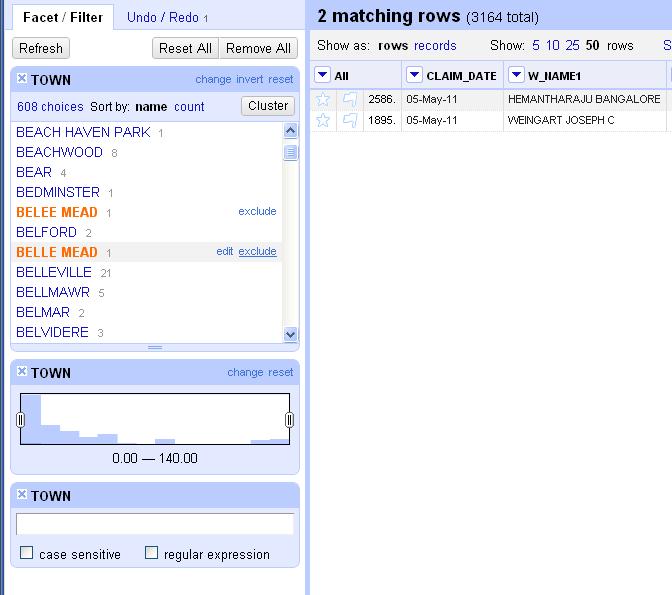
The facet will create a box in the left column with the total number of choices and a list of all the possible choices in this column and the number of each. You’ll see there are 608 options. At the top is “ABERDEEN” with 3 occurrences. Scroll to the bottom and click on “Facet by choice counts.” This will create another box that will let you display only the choices that occur a certain number of times. It shows the range of values in a column and helps you to spot anomalies or outliers. For instance, if you move the boundaries to only show the choices with between 120 and 140 uses, you’ll only see “JERSEY CITY” and “NEWARK” rows. Close the “Facet by choice counts” box.
Scroll through the text facet box a little ways into the Bs. See the option for “BELEE MEAD”? It has one occurrence. Notice that two lines later appears “BELLE MEAD,” the actual name of the town. If you hover over “BELEE MEAD,” you will see the option to “edit” appear to the right. Click on that and then fix the spelling of the name in the box that appears. Notice that the choice count drops to 607.
Let’s look at another way to clean data. Scroll down a few more lines. Notice that there are two lines in a row for “BERKELEY HEIGHTS.” They’re spelled the same, so why are they listed separately? Because one of them has an extra space at the end of it that screws up the grouping. This is the kind of thing that back in the bad old days would make you throw your PC out the window two weeks into a data project. Instead, let’s get rid of all the extra, invisible spaces. Click at the top of the TOWN column, edit cells> common transforms> Trim leading and trailing whitespace. Notice again how the choice count dropped. We’re down to 573 town names now. We’re getting there.
So you could spend hours scrolling through and eyeballing similar names and editing them by hand using these methods, or we could unleash the real power of Refine: clustering.
Click on the “Cluster” button in the facet box. Click it and you’ll see something like this. The default method is “key collision.” That should only show a couple of options. Try changing it to “nearest neighbor.” I can’t exactly explain the algorithm behind it, but it’s obvious that it finds town names with similar names that should probably have the same name. You see similar sets like “POMPTON LAKES” and “POMPTON LAKE” or “E. ORANGE,” “E ORANGE” and “E.ORANGE.” Click the “merge” button next to each grouping and type the name you want them all to be changed to in the “New Cell Value” column and hit the “Merge selected and recluster” button at the bottom. You’ve just cleaned those messy columns to a single value.
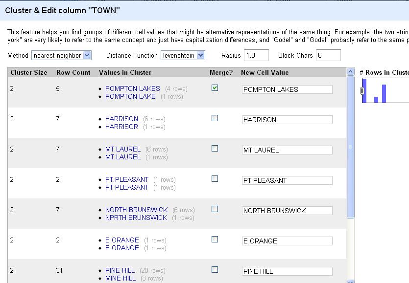
Scroll through the list, reclustering and editing whole chunks at a time. This is a huge time saver. When you’re done with the “nearest neighbor” clusters, experiment with “key collision” and see if it picks up any other similar names.
Now, keep in mind that to get this right, you’ll have to do some additional reporting. You’ll need to be certain that “NORTH BRUNSWICK” and “NPRTH BRUNSWICK” are indeed the same place and not separate values as they came to you. If you’re confident in your reporting, Refine makes the data cleaning easy.
When you’re satisfied that you’re done, click on “Export” on the upper right corner. You can output the file as html, TSV, CSV, Excel or any number of formats. Pull it into your favorite spreadsheet program and run your analysis. Then run it all again to make sure you got it right. To be certain, start from scratch and triple-check it.
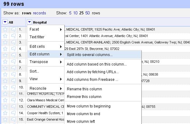
As cool as this is, Refine has a few more tricks for the beginner. Let’s look at this file of NJ hospital report cards.
Create a new project and import it into Refine.
Anything look weird? How about that first column. Seems like it includes information we’d probably want to split into several columns. In Excel you’d do this with a series of nested functions. In Refine, we can do it with a single click. At the top of the “Hospital” column, choose the drop-down menu and Edit column>Split into several columns…
When the wizard menu pops up, choose a semicolon as the separator and uncheck “remove this column,” because we always want to be compare against our original data, right?
So this looks better, with the name, street, town, state and zip code in separate columns. But something isn’t quite right. What about the zip code? Why is it only four digits? Oh yeah, New Jersey zip codes start with zeroes. Refine assumed that column was an integer and lopped off the zero at the front.
Another great feature of Refine is that it logs everything you do with the dataset. When you make a mistake or you want track back through your work, click on the “Undo/Redo” tab at the top of the left column and you can tiptoe back through your process.
Look at the list and click on the item at the top, “0. Create project” to jump back to that step.
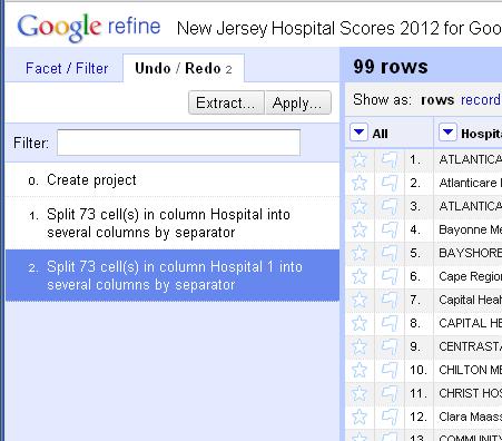
Now, redo the “Split into several columns…” step and this time uncheck “Guess cell type” to preserve the zips as text.
Be sure to make note of the undo option at the top of the screen. You can move a single step back at any time by clicking on this, much like the undo prompt that appears in Gmail after you archive or delete a message.
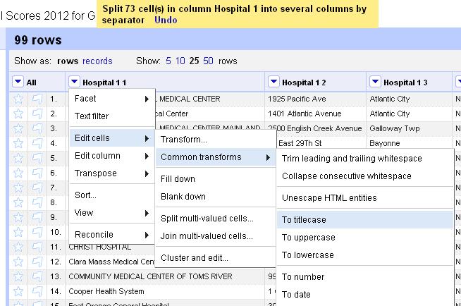
Finally, notice that the names of the hospital are inconsistent. Some are all uppercase. Others are only upper-cased. Let’s standardize them.
Click on the arrow at the top of the Hospital column and choose Edit cells> Common transforms > To titlecase.
Voila. A cleaned dataset. You’re welcome.
Let’s try one last dataset, this one looking at contributions from Nassau County, N.Y. police unions to political candidates.
Import the data into Refine and let’s start by trying to clean up the town names.
Add a text facet to the City column. Click Edit cells> Common transforms> trim leading and trailing whitespace
See the count change from 240 to 238.
Now, let’s cluster the city names to see if we can consolidate any entries.
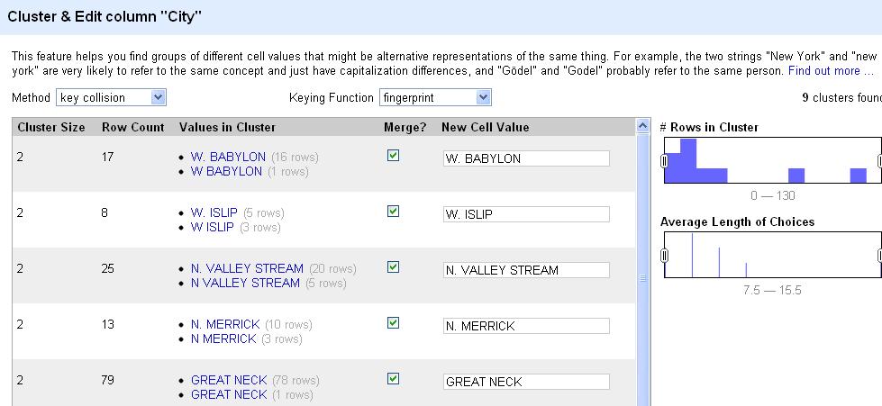
How do you see the count change in the city column?
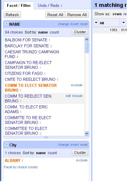
Now, let’s turn our attention to the Name column. For this exercise, let’s start by adding a filter on the city and just looking at “Albany.” You can also do this by clicking on Albany in the text facet box.
Keep in mind that any changes we make from here on out will only affect the “Albany” subset of the data until we clear this filter (or facet). Now, add a text facet to the “Name” column. Browse the first few entries. Notice there are a lot of very, very similar names here.
For the sake of argument, let’s say we’re interested in looking at how much Sen. Joe Bruno got from Nassau police groups. There appear to be 10 groups here with similar names receiving donations for Bruno. Seems like a good chance that many of these are the same organization. For the sake of argument, let’s say your reporting shows that yes, these are the same group and we want them to all have the same name for our analysis. Hover your cursor over each one and when the option to “include” appears on the right, click it. Once you’ve “included” them all, click the cluster button.
This will attempt to cluster the choices just in this selection to offer suggestions on names that could b the same. Change the method to “nearest neighbor” and the distance function to “PPM.” If you merge all of the offered suggestions under the same name, it will condense six of the 10 choices into one name. Then you can merge and re-cluster. Once you clean up all the suggestions, you can browse the data in the facet one last time and clean up any stragglers individually as needed. Believe it or not, Refine has just saved you a massive amount of time and energy.
What did we learn here today?
Refine is a huge time saver and allows you to do commonly tedious data cleaning tasks with a few clicks of the mouse. We saw how to:
- Import and export data.
- Copy and edit columns, trimming whitespaces or changing the capitalization.
- Use facets to filter and edit data
- Cluster a column to standardize spellings and entries.
This has been a whirlwind sprint through this program, but hopefully it’s given you a taste of what it can do.
In an ideal world, we’d get all of our data handed to us perfectly clean in easy to access, user-friendly, real time feeds that make for simple analysis and display.
But until then, we’re going to have to wrestle with the murky and messy datasets produced by those infinite monkeys making an infinite number of mistakes. Use Refine as your new big gun and never give up the fight.
And remember, if you let the monkeys who enter data into government spreadsheets win, this is where it will lead.

They’ll make a monkey out of you too.
Finally, if you want to keep messing with Refine, here are a pair of tutorials that put it much better than I can.
David Huynh, Refine’s creator: http://davidhuynh.net/spaces/nicar2011/tutorial.pdf
Dan Nguyen of ProPublica: http://dannguyen.github.com/NICAR-Google-Refine/
Good luck!
Tip of the hat to Liz Day of ProPublica for demanding more Simpsons and suggesting I add Troy McClure’s star turn in “Stop the Planet of the Apes, I want to get off!”